From Question to Report in One Click: What's New in Data Explorer
Your dashboards can tell you what happened. Can they tell you why?
Every CX team has more data than they know what to do with. Volume by channel, CSAT by team, response times by queue: it's all there, sitting in a dashboard somewhere. But a chart showing a spike in escalations doesn't tell you which conversations caused it, or what to do about it. You still have to go dig.
That gap between “here's a number” and “here's what to actually do” is where most reporting tools stop short. You get the what. You rarely get the why, and you almost never get a fast path back to the underlying conversations that explain it.
That's the gap Data Explorer was built to close, and it just got a lot more useful.
A quick reminder: what Data Explorer actually does
Data Explorer is Kustomer's shortcut from a question to an answer. Instead of building a report from scratch or waiting on someone else to pull the numbers, you can just ask: “Compare average CSAT score by team for the last 30 days,” and Data Explorer runs the query, builds the chart, and explains what it means and if there are possible problems it’ll propose solutions.
That last part is what makes it different from traditional reporting. A regular dashboard shows you what happened. Data Explorer highlights the drivers, outliers, and anomalies behind the numbers, explains the operational significance in plain language, and gives you something you can act on immediately, not just a chart you have to interpret yourself.
It's already the go to for CX leaders who need answers fast: benchmarking teams, forecasting volume, mining voice of customer feedback, building rep scorecards, all without opening a spreadsheet. Now it's even more useful, because you don't have to stop at the chart.
What's new: drill-downs and one click saved reports
Two recent updates that will change how you use every chart Data Explorer builds for you.
See the exact conversations behind any chart
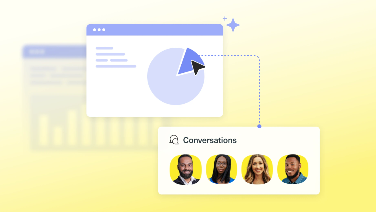
Data Explorer is now clickable. Select a bar, slice, or data point, and Data Explorer opens the exact conversations that make up that segment, matched to the same date range, dimension, and value you're looking at.
Say you ask Data Explorer to compare first response time for Enterprise versus SMB conversations, and Enterprise is missing its target. Instead of guessing why, click straight into that segment and see the real conversations. From there, you can click into any individual conversation to see exactly what happened. No separate search, no digging, no “let me get back to you.”
Save a prompt as a report, so you never have to rerun it
Once a chart looks the way you want it, you don't have to ask the same question again next week. Click Save Analysis as Report, and Data Explorer turns that exact prompt into a saved report in Custom Reports: same metric, same breakdown, same chart type.
From there, it behaves like any other report. Adjust the date range (it defaults to the last 24 hours, but you can switch to 7 days, 30 days, or whatever window you need), and it pulls fresh data every time you open it. You built the analysis once. Now it just runs.
Five ways to put this to work
Here are five prompts you can run today, along with why each one is worth saving as a report.
1. SLA compliance by tier
Prompt: Compare average first response time for the last 30 days for conversations tagged Enterprise versus conversations tagged SMB
If one tier is missing SLA, this is how you find out before a customer tells you. Drill into the tier that's slipping to see the actual conversations that blew the target, then save it as a report your CS leadership team checks every week instead of asking someone to pull the numbers manually.
2. Escalation root cause
Prompt: Show me conversation volume by contact reason for the last 14 days for conversations tagged Escalated
Escalations are expensive and usually clustered around a specific cause. This prompt shows you which contact reason is driving the most escalations right now. Drill in to read the actual tickets, and you'll walk into your next ops meeting with real examples instead of a hunch.
3. New account onboarding load
Prompt: Show me conversation volume by week for the last 90 days for conversations tagged Onboarding, broken down by contact reason
New accounts often generate a disproportionate amount of support volume in their first 90 days. This prompt shows you exactly when that volume peaks and what's driving it, so you can fix the onboarding step that's causing friction instead of just staffing around it.
4. Team and pod performance benchmarking
Prompt: Compare average CSAT score by team for the last 30 days
A straightforward benchmark, but a powerful one once you can drill into the lowest performing team's conversations. That's the difference between “Team B's CSAT is lower” and “here are the three conversations that show exactly what's going wrong.” Save it as a standing report and you've got a coaching tool that updates itself.
5. Channel mix shift
Prompt: Show me conversation volume by channel for the last 90 days, broken down by month
Channel preferences shift, and staffing and tooling decisions should shift with them. This prompt shows you the trend over time. Drill into the fastest growing channel to confirm what's actually driving the shift before you make a staffing or investment case around it.
Try it now
All five of these prompts work today, right in Data Explorer. Open Data Explorer and use them. Click into a segment to see the conversations behind it, and click Save Analysis as Report when you find something worth keeping.
If you're already a Kustomer customer, this is live in your workspace now. No new setup, no new permissions beyond having AI enabled features turned on.
If you're not yet a Kustomer customer and want to see what Data Explorer can do with your own data, book a demo with our team.